
Color Analysis Toolkit: Find Your Best Colors Fast
Finding Your Colors Step by Step: A Beginner-Friendly Color Analysis Toolkit for Confident Outfits
Color analysis can feel confusing at first—undertones, contrast, and “seasons” often sound more complicated than they need to be. A step-by-step toolkit streamlines the process with guided exercises, checklists, and ready-to-use palettes so wardrobe and makeup choices become faster, more consistent, and easier to repeat. For more guidance, see Colour Analysis Part I: Finding your Type.
The best part: you don’t need professional drapes to start seeing patterns. With stable lighting, a simple baseline, and a few smart comparisons, you can build a wearable set of go-to colors that make getting dressed feel surprisingly automatic. For further reading, see The Complete Color Analysis Guide.
What “finding your colors” actually means
“Finding your colors” is less about rules and more about results: which shades make your face look clearer, your eyes look brighter, and your overall look feel pulled together with minimal effort. When a color harmonizes, skin looks more even and lively; when it clashes, you may notice dullness, shadows, or an overly “made up” effect even with little makeup.
Most beginner-friendly methods boil down to three dimensions:
- Undertone (warm, cool, or neutral): the temperature that best supports your skin’s natural cast.
- Value (light to deep): how light or dark colors look most natural near your face.
- Chroma (soft to clear): whether muted, gray-dropped shades or crisp, saturated shades flatter you most.
Instead of chasing a perfect label, a practical goal is to build a reliable palette for clothing, accessories, makeup, and even hair color direction—so choices repeat well across seasons and shopping trips. For extra color context, resources like the Pantone Color Institute and Britannica’s overview of color are helpful references on how color is described and perceived.
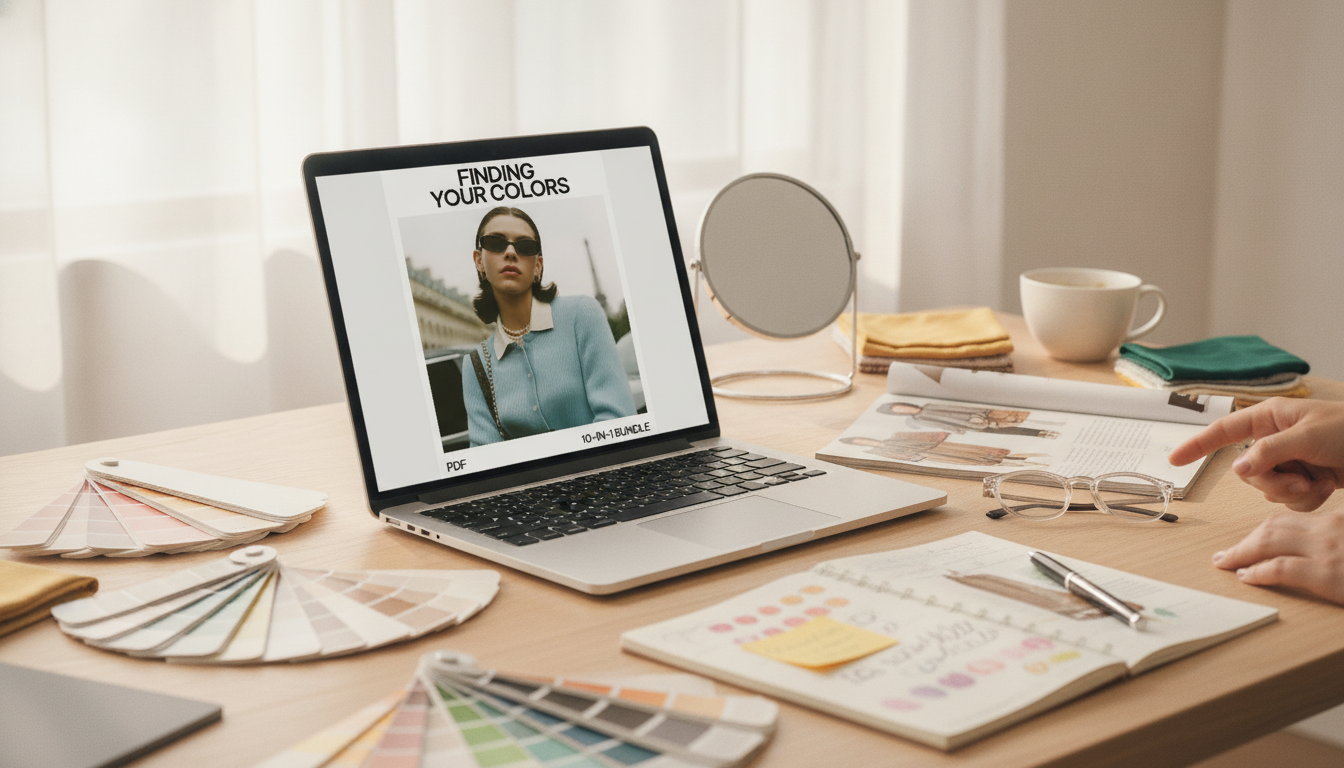
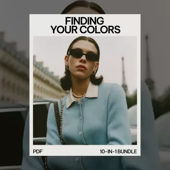
What’s inside the 10-in-1 beginner bundle
If you prefer a guided framework, the Finding Your Colors Step by Step Toolkit – 10-in-1 Color Analysis for Beginners Bundle with Guides, eBooks & Checklists for Personal Style & Fashion Confidence is designed to keep momentum high without needing expert tools. It breaks color theory into quick, doable steps, then turns your results into repeatable outfit decisions.
- Guides and eBooks that simplify undertone/value/chroma with practical comparisons.
- Shopping and closet-edit checklists that reduce “almost-right” mistakes (especially online).
- Exercises to identify your contrast level and apply it to tops, patterns, and accessories.
- A repeatable system: test → confirm → build a palette → apply to capsules.
| Component | Best for | Quick win |
|---|---|---|
| Step-by-step guide | Starting from scratch | A clear order of operations so results feel consistent |
| eBooks (reference) | Learning undertone/value/chroma | Fewer “close but not quite” purchases |
| Checklists | Shopping and closet edits | Instant rules to evaluate color near the face |
| Palette worksheets | Building a personal palette | A small set of reliable neutrals + accents |
| Application prompts | Outfit planning and confidence | Repeatable outfit formulas that feel cohesive |
Step 1: Get reliable lighting and a clean baseline
Before you judge any color, make the testing environment boring—in the best way. Use indirect daylight when possible (near a window, not in direct sun). Avoid mixed lighting, like warm overhead bulbs plus daylight, because it can make warm shades look “right” for the wrong reason.
- Start with minimal makeup and keep the neck/chest area visible if possible.
- Wear a neutral top near the face (white, gray, or black) so it doesn’t compete with your test colors.
- Take quick comparison photos in the same spot; patterns emerge faster when the lighting and angle stay consistent.
Step 2: Narrow undertone without overthinking it
Undertone testing works best with simple side-by-side comparisons. Hold two options near your face and look for what improves overall clarity.
- Try warm vs. cool references: gold vs. silver jewelry, warm beige vs. cool taupe, coral vs. berry.
- Watch for skin effects: a good match often softens redness and reduces under-eye shadow contrast; a poor match can emphasize texture or make skin look sallow.
- If both warm and cool look good, call it neutral-leaning and move on—value and chroma often matter more than the “warm/cool” label.
If under-eye shadows are a recurring distraction during testing days, a gentle self-care reset can help you see color effects more clearly. The Naturally Awake: Puffy Eye Solutions – Natural Remedies for Puffy Eyes Guide can be a useful companion when you want to minimize puffiness and focus on how shades truly interact with your face.
Step 3: Identify value (light vs deep) and contrast level
Value is about lightness and darkness. Some people look instantly fresh in ivory, soft pastels, and lighter neutrals; others look more grounded and vibrant in espresso, navy, forest, and jewel tones.
- Test a light neutral (ivory/stone) versus a deep neutral (espresso/ink) near the face.
- Notice whether your features look more defined or more washed out.
Contrast is the difference between your hair, skin, and eyes—and how much separation your outfits can carry.
Step 4: Decide between soft vs clear (chroma)
Putting it together: turning results into a wearable palette
When you want the process laid out like a checklist—test, confirm, and then translate results into outfits—the Finding Your Colors Step by Step Toolkit – 10-in-1 Color Analysis for Beginners Bundle with Guides, eBooks & Checklists for Personal Style & Fashion Confidence helps keep your palette consistent so it’s easier to shop and easier to get dressed.
Closet and shopping shortcuts that prevent costly mistakes
FAQ
What is the rarest season in color analysis?
“Rarest” depends on the color system and the population being referenced, so there isn’t a universal statistic. Some consultants suggest certain seasons are less common in specific frameworks, but the most useful focus is your personal undertone, value, and chroma match—not how rare a category sounds.


Leave a comment