
Find Your Best Colors: Cool, Warm & Neutral Undertones

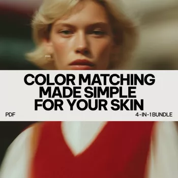
Color Matching Made Simple: Build a Wardrobe Palette That Flatters Your Skin Undertone
Color harmony gets easier when clothing, accessories, and makeup work with the skin’s undertone instead of fighting it. Once undertone is clear, shopping gets faster, outfit repetition looks more polished, and “why does this shade look off on me?” moments drop dramatically. Below are quick undertone checks, dependable color families for cool/warm/neutral, and practical outfit formulas—plus a ready-to-use digital bundle for fast matching.
Why undertone matters more than skin depth
Undertone is the consistent color cast under the skin—cool, warm, or neutral—while skin depth is how light or deep the complexion appears. Two people can share a similar depth (for example, both “medium”) yet look best in very different colors because undertone drives harmony near the face.
When undertone and clothing align, skin tends to look clearer, more even, and naturally bright. When they clash, redness, sallowness, or under-eye shadows can appear stronger—even if the color is “pretty” on the hanger.
Lighting also matters. Warm indoor bulbs can skew everything toward yellow, and strong overhead lighting can exaggerate shadows. For the most reliable read, compare colors in indirect natural daylight when possible. For a deeper background on how color relationships work, references like Britannica’s overview of color theory and the Pantone Color Institute can be helpful context.
Fast undertone checks that work in real life
1) Jewelry test (fastest for many people)
Gold tends to brighten warm undertones, while silver often looks crisp and “sharpening” on cool undertones. If both metals look equally at home, undertone may be neutral (or neutral-leaning).
2) White vs. cream test (surprisingly accurate)
Hold a bright white top and an ivory/cream top near your face. Bright white often flatters cool undertones; cream/ivory often flatters warm undertones; neutrals can usually wear both and choose based on desired contrast.
3) Vein check (useful, not perfect)
Bluish or purplish-looking veins can suggest cool undertones; greenish can suggest warm; a mix can suggest neutral. Because skin thickness and lighting vary, treat this as a clue—not a final verdict.
4) Sun response (only as a supporting hint)
Frequent burning can correlate with cooler-leaning complexions, while easy tanning can correlate with warmer-leaning ones. But this isn’t definitive on its own; use it to confirm other tests, not replace them.
5) Always test fabric near the face
Your face is where undertone is most noticeable, so a neckline test beats a wrist swatch. If you’re deciding between two shades online, compare them to a photo of your face in daylight (not a filtered selfie).
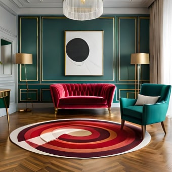
Clothing color guides for cool, warm, and neutral tones
Think of undertone as the “temperature setting” that makes your wardrobe look intentional. If a color ever feels like it “wears you,” shift one variable: saturation (muted vs. vivid), temperature (warmer vs. cooler), or contrast (pairing light and dark).
Undertone-to-wardrobe cheat sheet
| Undertone | Most flattering neutrals | Strong accent colors | Colors to use carefully | Easy outfit formula |
|---|---|---|---|---|
| Cool | true white, charcoal, navy, cool gray | cobalt, emerald, magenta, blue-red, icy pastels | orange, tomato red, camel (can look dull) | navy + crisp white + silver accessory |
| Warm | ivory, camel, warm taupe, chocolate, olive | mustard, terracotta, coral, warm greens, warm teal | icy pastels, stark white, blue-purple (can look harsh) | cream + camel + gold accessory |
| Neutral | soft white, mid-gray, navy, taupe, cocoa | dusty rose, teal, berry, forest, balanced reds | extreme neons, very icy or very orange tones (test near face) | taupe + denim + balanced red lip or scarf |
Quick “save” moves when a color is close-but-not-right
- Too warm? Choose a bluer version (e.g., berry instead of coral) or add a cool neutral like charcoal.
- Too cool? Choose a golden version (e.g., warm teal instead of icy turquoise) or add camel/cream near the face.
- Too bright? Try a dustier, muted version in the same family.
- Too heavy near the face? Move the color to pants, shoes, or a bag and keep neckline shades in your best neutrals.
Black, white, and denim: make “universal” basics actually work
Black
Cool undertones often look sharp in true black. Warm undertones may prefer softened black (washed black, black-brown, or black paired with warm accents like camel, cream, or gold). Neutrals can go either way—choose based on how bold you want the contrast to feel.
White
Denim
Accessory and metal pairing that elevates the palette
If you’re also adjusting makeup to match undertone (especially base products), the American Academy of Dermatology Association is a solid resource for skin basics that support a smoother, more even look regardless of shade choices.
Make matching effortless with a ready-to-use digital bundle
For a faster, less guessy approach, Color Matching Made Simple for Your Skin – 4-in-1 Digital Bundle | Best Color Palette for Skin Undertone | Clothing Color Guides for Cool, Warm & Neutral Tones maps colors to cool, warm, and neutral undertones so you can make decisions quickly.
If you’re also focusing on a more rested-looking face (since undertone clashes can emphasize under-eye shadows), Naturally Awake: Puffy Eye Solutions – Natural Remedies for Puffy Eyes Guide can pair nicely with a wardrobe refresh for a more pulled-together overall effect.
Common mistakes and quick fixes
FAQ
Can warm skin tones wear black clothing?
Yes. Warm undertones often do best with softened blacks (washed black or black-brown) or by pairing true black with warm accents like camel, cream, and gold so the face still looks bright.
Is it better to wear gold or silver with warm undertones?
Gold is usually the easiest match for warm undertones, and rose gold, brass, and bronze can be especially flattering. Silver can still work when it’s a softer/brushed finish or balanced with warm colors elsewhere in the outfit.


Leave a comment